Being able to paint blurry backgrounds is a vital skill for many watercolor artists. There are a few different ways to go about it.
To paint blurry backgrounds in watercolor paint wet on wet and let the colors bleed into each other. Choose pale colors so that they do not overwhelm your subject.
When I want to paint blurry backgrounds in my watercolors I use different techniques depending on what I am painting. I share these below.

How Do You Blur Backgrounds With Watercolor?
To blur the background in watercolor painting you need to paint wet on wet.
If you paint on dry paper you get the effects you see with the red and brown strips of paint shown here.
Here I have painted a strip of red on dry paper. You can see the edges are not soft and the color is firm and hard. I could have painted less color but the edges would still be hard.
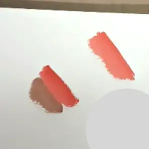
If you look at the brown and red strips together you can see how the edges join together. You get some interaction but not much.
What you want for blurry soft backgrounds is for the paint to mix and interact.
To do this you need to paint using wet on wet techniques.
What Is Wet On Wet?
Wet on wet is where you wet the surface of your paper with water before you start painting. You then paint on the wet surface. This is a great way to paint blurry backgrounds as the paint is soft and the edges mix and blend into each other.
How To Paint Blurry Backgrounds Wet On Wet
- Quality watercolor paper of any thickness*. I used Saunders Waterford 300g/140lb cold-pressed (Stonehenge Aqua cold press is a good alternative). Prepare thinner paper as usual by taping it to the surface.
- Larger watercolor paintbrush. Any quality watercolor brush. I use a range of brushes from Winsor and Newton and others.
- Clean Water
- Your chosen colors of watercolor paint. I used cad red, yellow, and ultramarine blue plus a purple lake (a pinkish purple) and leaf green (a bright clean green) You can do this with only the 3 primaries though. Don’t go spending on the fancy colors if you don’t need to. A quality student watercolor paint is fine from a good brand. I use both student and professional colors from different brands like Daniel Smith & Winsor and Newton. Don’t get a really cheap paint though.
- A palette.
This is your basic Blurry Images Materials List here on Amazon. (Affiliate Link).
*Thicker paper is better if you are painting very wet. the thinner paper will buckle however it should flatten when dry. The buckling can affect your paint flow. Don’t worry for now. Use what you have to hand.
1, Mix all of your colors in advance. You want to add water so they are not too thick. But you don’t want them too runny either.
2. Use your large brush to quickly cover your paper with plain water. You can also use a colored wash if you prefer but it will affect the colors put on afterward.

3. Allow your water to dry to a soft sheen. How you can tell if it’s ready is to look at the paper at an angle with the light on it. If it’s really shiny it’s still very wet (some people like painting like this but you have little control over the mixes). If your paper is satin in look and has some sheen it is ready to cover.
4. When your paper is at a soft sheen drop or brush your colors randomly onto your paper. Allow them to spread freely. They will blend into each other.
How To Tell If Your Paper Is Too Wet
In the picture shown here the paper is too wet. Ok slight overkill on my part but I wanted to make sure you could see it. You can really see the shine of the water.
If you look at how the paint reacts when it is too wet. Yes, it blends but it also runs and there’s little control nor that lovely soft cloud effect you get with watercolors. It spills into the dry areas. When you consider that this paper was completely flat on the surface it’s quite a mess.
Compare that with this image while it’s still quite wet you can see that it is starting to dry and the water shimmer rather than shine. It’s still too wet for me but any drier and you might not see it. You can see the difference in the way the paint acts on the paper. It’s now lovely and soft and spreads into each other beautifully. If you put the colors closer together they will blend to make other colors.

Tip: Control or Avoid the Following: At the bottom of the left-hand picture you can see what happens when the color touches the dry edges. You get a hard edge. If you have a lot of spare colors the water can build up at the edges.
You may want a hard edge if you have an object that the background goes around. But you don’t want a build-up of color.
A way to avoid this is not to have your paper too wet and to keep the color away from the edges. The color will work its way up to the edges but not create a hard line like the bottom left of the left-hand picture.
Ways To Control And Remove Hard Edges
If you already have a hard edge and it’s still wet. Rinse out and dry your brush on your kitchen towel. Then gently run your brush along the edges it will suck up the excess color.
If you just want to soften the edge I have explained how below.
How To Paint Blurry Edges With Watercolor Paints
If I want to paint blurry edges I don’t use masking fluid. If you use masking tape/fluid you will get a hard edge.
If you have used masking fluid you can soften the edges by using a damp brush and going over them. Some watercolor papers take this better than others.
If you are not using masking fluid when you paint the background wet on wet into the image and paint into the subject but not right the way up to the edge of the wet paint.
You can do the same with your subject.
How wet you make your paint and the size of the edges will depend on your subject and your style. Sometimes a blurry edge can be little more than millimeters others centimeters (1/4 inch).
If I’m painting botanicals my edges are only slightly fuzzy, barely noticeable.
To do this you can wet the edges again once dried or slightly soften them while wet. you only need a damp brush and not much water. This depends on the paper you are using and its quality.
If I were painting a cat with long fur then the edges would be much softer. I would let the paint bleed into the background much more.
To do this I would paint the background with a soft edge, and let it dry. Then paint the main subject also with a soft edge. Or paint the background and then paint the main subject while the background is still wet.
You have to be careful with colors and color strength as watercolor is transparent and you will see the color behind it. Decide what you want before you do it.
How To Paint A Faded Background With Watercolor Paints
- To paint a faded background paint your colors much paler than the foreground. Water down the colors more than you would normally.

2. The colors you choose, make a difference. Brighter colors tend to leap forward while darker or duller colors tend to fade into the background.
3. Fading a color using the same color. If you want a graduated fade then graduate the color intensity with the farthest colors being the palest. To do this add more water to your colors. Remember also that watercolor dries paler than the wet color.
4. Also, if you paint your background blurry this helps to fade your background. This is because things with less definition come across as being farther away.

5. If you have a good quality watercolor paper you should be able to layer your image as I have done with this one above.
By adding bright colors to the foreground it helps with the fading of the background. Here I waited for the background to dry. Rewetted the paper with plain water then added more intense colors. This picture is in fact the same one as above only with more color added. You can see how the bright colors really push the background further back.
Do You Paint The Background First With Watercolor?
You usually paint the background first in watercolor if it is a large area. This prevents your background from damaging your picture. When you add your background it changes the look of your painting. It’s much easier to paint the main subject if the background is done.
You can paint it in pale colors and then add more color later if needed. If you have a background it gives you an idea of the overall look and more cohesion.
Painting the background first is particularly important when you paint landscapes, seascapes, and woodland. You need the pale distance or sky put in first and work forward to closer objects.
If you are painting things like birds, still life portraits, etc, and haven’t painted the background and have painted the subject first you can add it later. Some artists prefer to do this. It can make it awkward to paint. You can just leave the background white as well. That can look quite good for some subjects. Or just paint a small area around part or all of your subject.
