If you want to make an acrylic color chart there are a few ways to do it depending on what you want to use it for. I have found that it is a good idea to have a master chart of your main colors or all of your colors and smaller more specific charts. I share some of these ideas and methods here.
- To make an acrylic color chart you need paper for acrylics, paints, brushes, water, and tape.
- Create a grid for the number of colors you want to put on your chart.
- Put tape on the grid lines to separate your paints.
- Methodically take your paints from light to dark and mix them together
- Label the boxes
- Paint those colors in the correct boxes.
- Let it dry
- Remove the tape.
When you are a painter it is vital to be able to create your own color charts. There are several reasons for this: often paint names are different or the pigment mixes are different between brands. This means you might not get the color you expect. The colors you see on the computer no matter how hard you try aren’t always accurate because each screen is different. The same goes for colors in books. And no matter how many books you have they might not always have your paint colors in them. Although, I find books a very good resource. Below I share a way to create your own charts and put your own spin on them when you create yours.
When I was younger I hated doing color charts. I was like give me the color already. I just want to paint. lol. I didn’t understand how just by painting the charts you could learn so much. Nor that these charts could be a very useful resource that would save you time and enrich your painting.
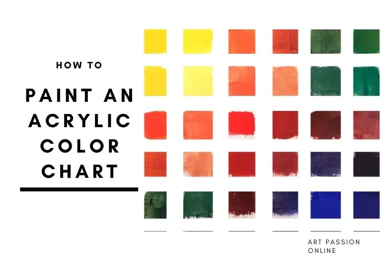
How To Make An Acrylic Color Chart
Although I am concentrating on acrylic painting there is no reason why the techniques can’t be used for oils or watercolor charts as well. There is a proper way to do color charts. If you read any color mixing book they tend to do it in the same way.
Why You Want To Make A Color Chart
An artist might want to make a color chart for different reasons.
- They may want to use the chart as a color reference guide as to how each of the colors they have looks painted clean out of the tube.
- An artist will also want to know how these colors mix together to make new colors.
- They may not know how to mix colors so will want a chart of color mixes to experiment with so they know how to mix them in the future.
- It’s also useful for specific projects or more detailed references.
- It’s the most accurate record of your own paints.
Items 1 and 2 can be either separate charts or one combined chart.
It’s important to know your reason for making the chart before you start as your color choices and in some cases, the type of chart you make will be different depending on your desired end result
I will explain this method in this article
However, I feel that a color chart should not be an exercise in rigid rules but should be there as a useful working tool to help the artist with their specific needs. A standard color chart does this but there is no reason why it cannot be adapted for you as an artist.
If you are new or fairly new to art you might want to do a more generic chart to give you a good overview of the colors and how they work. Artists also do this if they get new colors or change brands as it gives them a good idea of how the color works.
If you are painting more specific things like all landscapes or all animals for example you might want to do a chart that is more specific to your needs.
Type Of Acrylic Painting Charts
There are different types of color charts that you can make. Also while there are standard charts many artists create their own variations of these methods that suit their needs better.
In this article, I am going to share methods of making grid charts with acrylic
- A standard master grid chart using 6 colors here but you can use more if you wish
- A 3 color chart
- An extension chart not standard
- Simple artist subject-specific chart
Tools Needed To Make Your Chart
- Pencil – optional
- Ruler
- Eraser
- Artist tape that can be removed from the surface without damaging it
- Very thick Watercolor or Acrylic paper or canvas sheet) can also be used
- Your chosen tubes of paint.
- Water – or mixing mediums
- Brushes – You can use any brushes you have. I have found that the flat brushes work the best for me. But if you have a filbert or round brush they can also be used
- Optional: Palette knife for mixing (acrylic or oil mixing). You can use your brush to mix if you prefer
Tips:-
- Make sure you put in the writing when you do it.
- Mix every color with all the other colors – something I don’t do
Note: Because I am often doing specific samples my color “charts” do not follow the general guide 0f 50/50. I like to give a sliding scale of several colors where possible. So my way of doing charts isn’t always standard.
So, here I am going to do a standard chart with a limited palette of colors. Then a non-standard one.
Winsor and Newton do a system of 3 & 6 colors. I am using these colors that they list as near as I can for my 3 & 6 color charts to show you just how many colors you can make from a very limited palette.
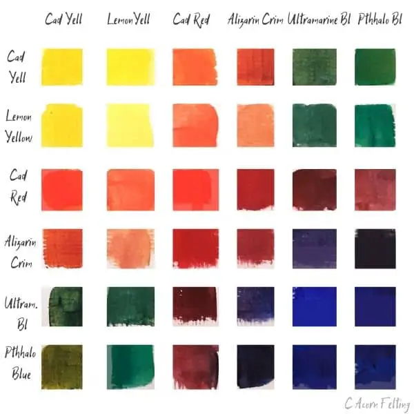
Master Color Chart Using Only 6 Colors
The six-color system uses 6 colors, 3 of each primary color, red, yellow, and blue. It doesn’t matter if you don’t use the same colors that I use as you are making your own chart for use and it should represent your needs. However, 3 of the colors should be warm and 3 cool, i.e. warm red cool red, etc.
Winsor and Newton recommend transparent colors for better cleaner mixes.
You will be surprised at how many colors you can get from these six.
You don’t have to have these exact colors. The names will vary from brand to brand. If you have slightly different ones, use those just as long as you have 3 warms, and 3 cool primaries.
- Azo Yellow Deep cad yellow
- Lemon Yellow
- Cadmium Red
- Alizarin Crimson
- Ultramarine Blue
- Phthalo Blue
You Are Creating This Acrylic Chart:
To Make This Color Chart
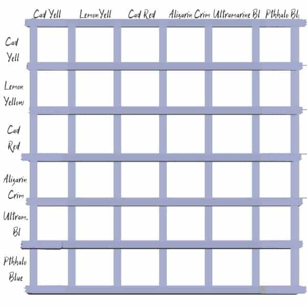
- Take your pencil, ruler, and paper and create a grid 6 squares wide by six squares deep. Make sure you leave a space around the edges so that you can write your color names above each square.
- Write The names of your paint colors along the top and in the same order down the side. Some people prefer to start the top left grid with white. I have started here with Cadmium yellow. Traditionally the colors start from light to dark. So this is why I started with yellow.
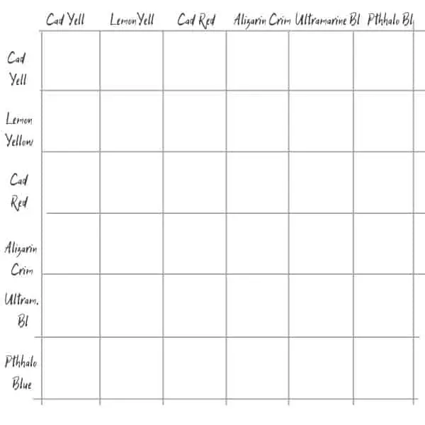
3. If you want to keep the edges of the squares neat and tidy place a long strip of masking tape along the lines. Once you have finished painting you can remove the tape and erase the lines and get nice neat edges. Whether you use tape or not you still need to make sure you have white space between each of the colors as the colors next to your desired color will influence what you see.
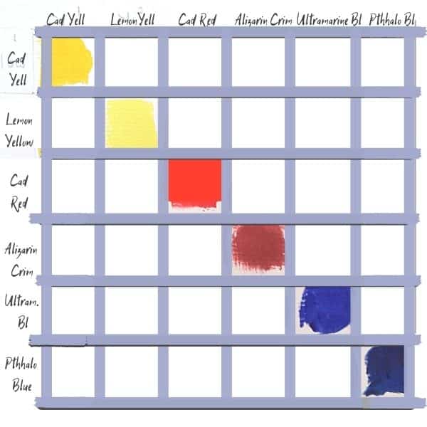
4. Put out each of the colors onto your palette. It’s easy to get distracted or accidentally put in the wrong color. If you feel this is the case start with only the warm or cool colors one each of yellow red and blue.
5. Now fill in the colors on your chart. Start with your pure colors unmixed. You need to paint up to the edges if you want it tidy. I’m not that tidy and like the natural brushed edge look but it’s not for everyone. I have tidied it up for these examples.
6. Mix your colors in order and place them on the chart. Try to mix as best you can 50/50 mix of each color.
Note using this method you will have two of each color on the chart.
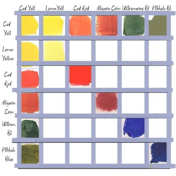
- Yellow 1 Plus yellow 2 (cadmium yellow plus lemon yellow for me)
- Yellow 1 plus red 1
- Yellow 1 plus red 2
- Yellow 1 plus blue 1
- Yellow 2 plus blue 2
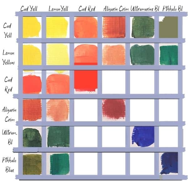
Now continue with yellow 2, red 1 and 2, and the 2 blues. and mix each of the colors until the whole grid is full as shown in the examples below.
First Row and Column of the Colour Chart Filled In
Below is the 2nd Row and Column of the Chart
3rd Row and Column Filled In (Below)
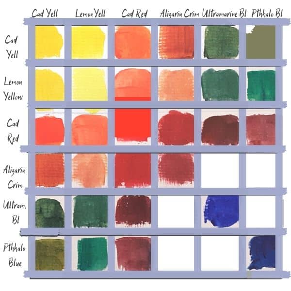
The four sections of the chart are filled in (Below)
7. Full chart with tape. Once you are happy with your chart carefully remove the tape.
The Finished Acrylic Colors Master Chart
This is a good starting point as it will give you a better idea of your colors and what they really look like. It will also show that you don’t have to buy every color available to get the colors you want.
However, this chart does not even begin to cover all the color options available to crfeate from these 6 colors.
If you take any one of these colors and change the amount of the other color mixed to it either less or more this increases your color ranges substantially. It doesn’t even cover the browns.
Then if you add white which is a staple in acrylic painting this increases the colors still further. Note though that titanium white is usually more opaque so you’ll lose some of your transparency.
I have done this with the limited 3 color mixes below.
Color Mixing Chart Printable pdf
If you want to use the main chart I have created a pdf you can download below.
The 3 Color Limited Palette Acrylic Color Chart
The 3 color system consists of a limited palette of the three primary colors 50/50 mix top chart; I am using System 3 Student paints for this example (although they say pros can use it too).
- cadmium red (semi-transparent)
- ultramarine blue (semi-transparent)
- cadmium yellow (transparent)
Fully transparent paints do give a better mix.
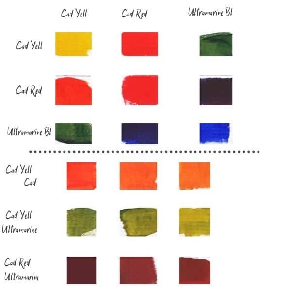
While technically the 2nd chart is not formatted as a chart I included it to show the extended range of colors you can get. I took the 50/50 mixes and increased the yellow for the top two and the red for the bottom one. Even from this limited palette, you can mix many different colors. The oranges did not really show up as well on the first chart when photographed but you can really see them on the second chart.
How To Create A Color Chart of Your Subject To Be Painted
I like to create charts for when I paint a subject that way I already have the colors I need and know what I am using before I start.

Photo by Rana Sawalha on Unsplash With Thanks
There are different ways to do this
- You can simply create your list by eye and pick out the most important colors and mix as you go.
- You can do the same as number 1 but create a simple table/chart of the most important colors.
- You can use a color picker if your image is on the computer to determine what colors you want to use. This works as a good guide but I find the colors feel false so take this into account when you mix. This is a great start but you still need to know how to mix those colors, which to me is why you create the original chart in the first place.
So you are not inundated with colors it’s a good idea to blur the image slightly to reduce the number of colors. A tip I got from Jason Morgan (Wildlife Artist).