If you have been struggling to make purple you might be wondering if what you were taught at school was right and what acrylic paints really make purple. You are not alone. Most beginner artists go through this. I know I did when first started.
To mix purple red and blue make purple regardless of your painting medium. However, because in painting the colors aren’t pure and have a color bias of the seemingly absent colors if you mix red and blue the purple you get will vary depending on that bias.
If you’ve ever just picked up a red and blue from your paints and mixed them you will know that despite what we were told at school red and blue don’t always make a beautiful purple. I’ve had this problem in the past especially when I’ve only had a few acrylic paints and been stubbornly insistent on making a purple even though I didn’t have the best colors for the job. I learned the hard way. Here I share that information with you so you don’t have to.

What Acrylic Paints Make Purple
We are taught from a young age that purple is a secondary color that is mixed from the two primaries red and blue.

When we apply this to art mixing colors we then can’t understand why we get this:
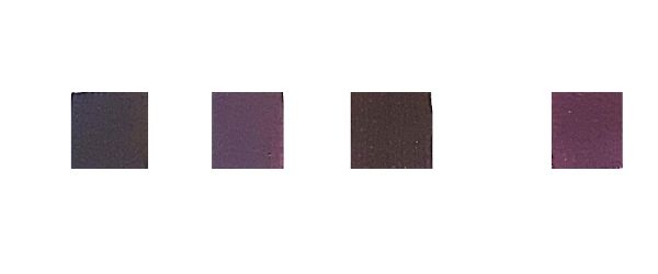
These examples include two different blues and different reds mixed. Technically they are all purple but not what most people want to mix when they think of purple. Changing the quantities does not make a vibrant purple and neither does white. this is due to the color bias of the paint. (There are other reasons, but I’m sticking to color bias for this article as that will get you the colors you want.).
How Color Bias Affects The Purple You Get
If you’ve read any of my color mixing articles you may have heard me mention color bias before.
The colors we use have a color bias so they lean slightly or a lot to the colors on either side of them on the color wheel. For example, you can have a red with orange or blue bias.
This affects the outcome of the color mix and if used with the wrong color bias can mean you end up with a dark subdued purple. This is because you are in effect adding the complementary color of the color that you are mixing.
The best way to mute a color and tone it down is to add its complementary color. This is great if it’s what you want, but if you want a bright purple it’s a pain in the butt!!
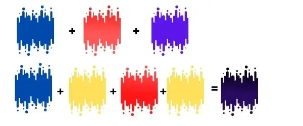
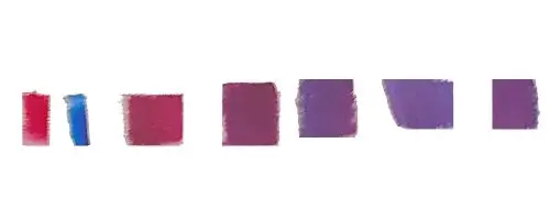
Row one in the picture above shows the two colors you mix and what you expect to get.
Row two shows what colors you are most likely mixing. Here, when you think you are mixing red and blue to make purple, you are mixing yellow in as well. What happens when you mix the three primaries you get brown or black depending on the quantities. If you don’t get brown or black because there isn’t enough of the 3rd color it does muddy your color.
Here is why. If you are using any of these colors you are not only mixing red and blue together, there’s a good chance you are mixing in yellow as well.
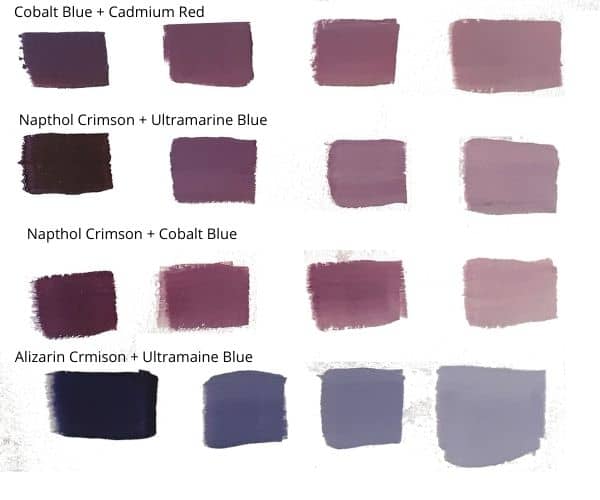
Let’s start with two popular colors that are in many starter packs. Ultramarine blue and cadmium red.
Ultramarine is usually blue with some red (although sometimes green so watch out for this). Cadmium red is red with a yellow bias. Due to the yellow complementary color to purple, this should give a dull purple.
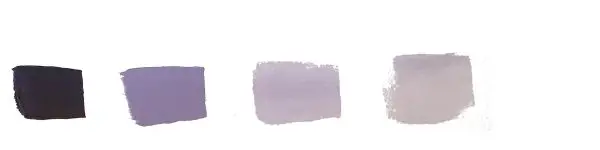
Left pure color mix, then with increasing amounts of white.
- Ultramarine Blue (a blue-red)
- cobalt blue (hue) (greenish mid blue/ neutral)
- Phthalo blue a green-blue (usually)
- Cadmium Red – yellow red
- Napthol Crimson – a blue red
- Pyrrole Red – mid shade red with slight blue undertones
- bright blue red
- Vermillion (Hue) a bright yellow-red with pink undertones
**Note: Some of these colors bias may change depending on the brand and whether they are student or artist quality.
- To avoid the complementary color dulling down your purples you need to choose a blue and red that lean to the red or the blue and avoid those with the green or yellow complementary colors in them. These should give you a cleaner brighter color purple.
- The amount the reds and blues are dulled down will also depend on the amount of the commentary colors or green and yellow that are in them.
- The darkness of your purple at a 1:1 ratio will depend on how much blue is in your blue and red. If you pick a blue red your purple will start off darker than if you pick a brighter more neutral red.
I have heard artists say that these are horrible purples. I disagree. I actually like some of these dusty colors. You don’t always want the brightest color out there. It’s about getting the color you want though. In this case not any of these.
How To Mix A Beautiful Bright Purple
Here I have chosen a blue that leans to the red and a red that leans to the blue. I also avoided those with the green or yellow complementaries. You can clearly see the difference:
The colors I used here above are Quinacridone Violet and ultramarine blue.
You can do this with most blues that lean to the red and reds that lean to blue. However, You should avoid any colors with white unless you want a chalky purple color.
Other colors that you can use are:
- If you don’t have any Quinacridone Violet swap it for Permanent Rose and ultramarine blue instead.
- Ultramarine and Quinacradone Red
I found this video on YouTube it explains it beautifully
How To Make Dark Purple Quickly
The best way to make a dark purple is to take the purple color you want to use either pre-mixed or mixed by yourself and add its complementary color to it in very small stages. So as yellow is purples complement on the color wheel you can add that.
the much-disputed alternative is to add black instead. However, avoid black until you are more experienced if you can.
