Turquoise is a beautiful color to mix. It is also an easy color to mix with lots of vibrant variations and color choices. So it is likely that you already have the colors you need to mix turquoise in your palette.
You can use many different colors to mix turquoise. You need a blue and green, or a blue and a yellow depending on the bias of your colors. The quickest way to mix turquoise is to use cerulean blue on its own or with a touch of viridian. There are many variations of these colors.
The examples above cover some options for mixing turquoise. But there are many more exciting turquoises you can experiment with as well depending on the colors you have available to you on your palette. You don’t need any special colors. As shown below you can get a beautiful turquoise from many colors that you are already likely to have on your palette.
General Guide To Mixing Turquoise
- When you mix turquoise take advantage of the subtle variations of color.
- If you are using one of the brighter colors like Veridian or Phthalo only use them sparingly to start with they can be a bit overwhelming.
- Don’t limit yourself to the colors mixed in this article. If you have other blues or greens try them out to see if you can increase your range.
- Decide if you want a cool or warm turquoise, a vibrant or subdued one as this makes a difference to the colors you choose.
- If you want to do the crest of a wave make sure you use color mixes that are less opaque to add intensity and the feeling of seeing through the wave. Always consider if the colors are opaque or transparent.
- Use the white of your pad/paper for ‘mixing’ the color to vary the color.
- Keep in mind the variations of the manufactures paint. They may add or subtract a yellow or blue for example which will make a difference to your color mix.
- Switching colors may add more variants to these options.
- I have done quite dark strong mixes in this article using less water than I would normally so they are clear for you to see. you might prefer a more translucent watery mix of your color.
About Turquoise
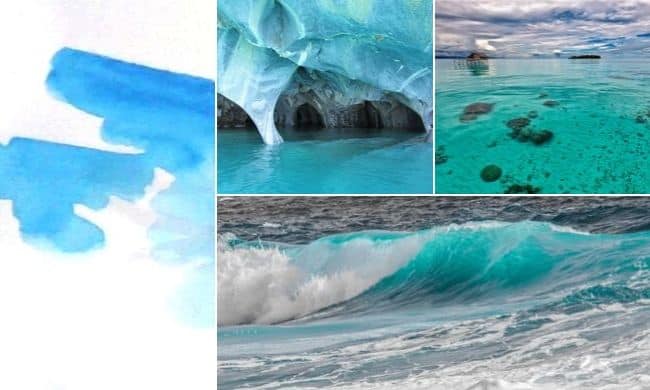
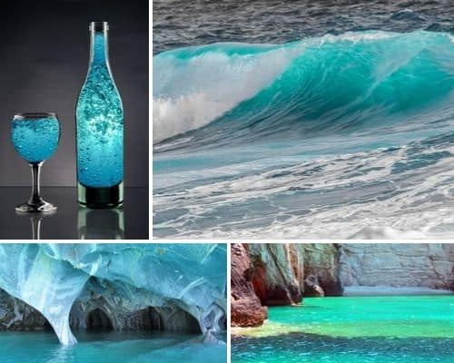
When I started this article I knew what needed to be said about turquoise. It is the light blue-green of the Mediterranean sea.
Where I used to live (not the Mediterranean) I used to walk to work and the sea below was sometimes that color exactly. The sea pictures chosen here are similar but slightly less green.
But when research started it became clear that different people had a different understanding of what turquoise is. To some it is light blue-green, to others, it is a light blue. Curious, I even asked the lady in the sewing shop could she point out the turquoise cotton. She waved her hand over several kinds of cotton. Some I would never have called turquoise, more teal. I separated the colors but many people don’t. They are all in the same or similar range. This is useful if you want to paint the different colors of the sea for instance.
The reason there is so much variation in opinion I believe is due in part to the stone itself. In order to mix it, we need to know what color we are aiming for.
Turquoise is a mineral that is blue-green in color. The color of the stone varies from mostly blue to greener hues and shades. If you search online for images a variety of colors come up in the results.
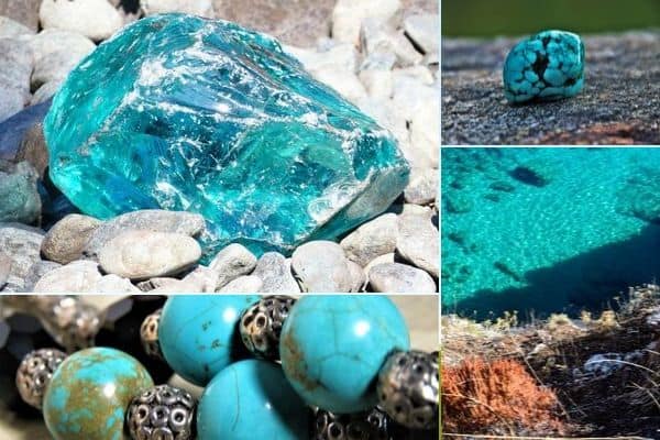
The dictionary definition for turquoise is that turquoise is a greenish-blue color and that it is also a stone of a greenish-blue color or sky blue.
Mix These Colors To Make Beautiful Turquoise
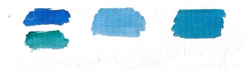
Tubed Turquoise Mixes Example For Reference
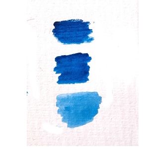
Above is turquoise straight from a tube of watercolor paint. As you can see the bottom one is near to the cerulean blue. The top darker one looks similar to phthalo/intense blue.
This tube is Winsor & Newton Cotman watercolor and made from pigments PB15 & PG7. PG15 is a Phthalocyanine Blue aka the pigment that makes Phthalo blue. This explains why it looks similar when darkened and why it looks cerulean when lighter (it’s also in cerulean blue). PG7 is Phthalocyanine Green BS, a deep blue shade of green. (Source).
Now to experiment with mixing different variations of turquoise.
Turquoise Mixing Examples
To mix a beautiful turquoise you need to know what colors make up turquoise. These are essentially blue, or blue and green some blues and greens make a better turquoise than others.
To make sure I covered as many variations of turquoise as possible I have included several variations of the mixes to make different turquoise. I have used those that most people will have and shared an actual tube turquoise fo your reference. Even if you don’t have the exact colors you can still try out a commission of similar colors to see if they also work.
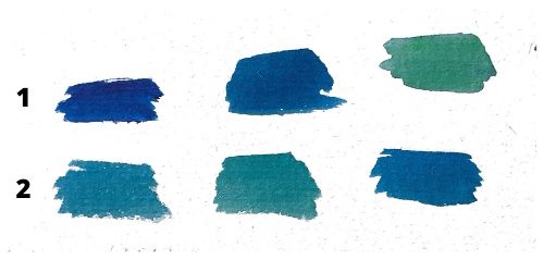
Mix Turquoise Using Cerulean Blue
On its own Cerulean blue makes a lovely light turquoise. Or you can mix it with other colors for variations.
For example, you can mix cerulean blue with a small amount of any of the following:
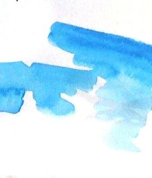
- Cerulean Blue + Viridian Green (first 2) phthalo/intense blue 3rd color on the row
- Cerulean Blue + Sap Green
- Cerulean Blue + Lemon Yellow
- Cerulean Blue + Cobalt
Adding a small amount of cobalt blue to cerulean makes a turquoise very similar to the tubed turquoise you can buy.
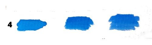
By adding different amounts of all the color combinations I have made a range of either blue or green biased turquoises. The bottom one number 4 the two blues are quite close together. you could also add a touch of one of the greens mentioned to make it a more blue-green but still light turquoise.
Use Phthalo Blue and Green For a Vibrant Turquoise
- Winsor and Newton use Phthalo Blue + Phthalo Green to make their turquoise.
- If you have those you could try to mix them to make your own turquoise. If you don’t you could use a combination of Phthalo Blue + Viridian Green instead.
- Viridian Green is similar to Phthalo Green and can be easily swapped to make a similar color.
- Here I have used Phthalo Blue (Intense Blue) + Viridian Green to mix Turquoise
As you can see this makes quite a good range of turquoise from quite light to a more vibrant one down to the darker more green turquoise.
Alternatively, if you don’t have Phthalo Blue you could replace the Phthalo Blue with :
Above are the following mixes:
- Phthalo Blue/Intense Blue + Sap Green
- Intense Blue/Phthalo Blue + Yellow
For me, these are in the darker range of turquoise. I wouldn’t really call them that at all. I’d call them more teal or just dark blue depending on the color mix. Phthalo blue is quite an intense blue, so you are already starting off in the darker ranges.
Note that intense blue and phthalo blue are pretty much the same color so will interchange very well when mixing.
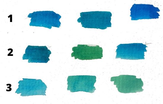
Below I have started off with a lighter range of turquoise mixes then going darker. You can see how varied they are. Asian watch that viridian as it is a very strong color. Only add small amounts
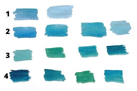
- Cobalt Blue + Viridian
- French Ultramarine + Cerulean + Viridian
French ultramarine blue & cerulean blue hue to give a color similar
French ultramarine blue & cerulean blue hue + Viridian - Phthalo Blue + Leaf Green (below)
- Phthalo Blue and Sap Green
MixingTurquoise Project Practice
Project 1 – Make A Color Chart
- Use the color mixes above to create a color grid of turquoise for your reference.
- Use different colors that are not mentioned here as well and add them to your grid. Remember it doesn’t matter if they don’t work you want a range of ideas that you can use in the future. You may have different paints than I do and it will give you a better idea of how your paints work.
- Create a range of colors from light to dark.
Project 2 – Paint Turquoise Trainers/Sneakers
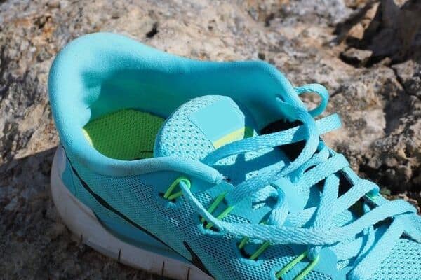
Use the color mixes above to paint this sneaker/trainer. You can download the trainer/sneaker outline here. Vary them if you need to.
Are Turquoise and Teal the Same Color?
I admit I do not consider turquoise and teal to be the same color. However, many people do think of them as the same. If you read my article above you will know of the seamstress who included it in the range of turquoise cotton. So why the confusion between the colors and what people think of them?
Certainly, when you search how to mix teal you get a load of turquoise results that comes up in the search. And when you mix darker turquoise as in some of the examples above it comes out as teal.
It’s understandable why people do think that. You can get teal by mixing some of the same colors as I have above for turquoise. The darker range is definitely teal. It is simply a darker color. If it were gray it would be a light gray and a dark one. You can mix a full range of sea colors from these colors which include both turquoise and teal if you start with the right blue and green.
If you think of beige. You think of it as a color in its own right. If then asked to describe beige most people would then say it is a light brown. Teal is the same in my view. Teal is a color in its own right. But you could equally say it’s dark turquoise.
My view is that as artists we need to separate these two colors because as a rule as artists we see more colors. Others may not, it’s all good. As long as you know what color you want and can mix it. If one thing color mixing for others has taught me is that we all see colors and define them differently.
If in doubt it’s a good idea to head for the tube – that is the paint tube. What color names have the large artist paint suppliers put on their tubes? This will give you a good idea of what the standard color is. I recommend that you do a teal version of Project 1 above. As you don’t want to be messing about when you are actually painting.
Even these vary, particularly with turquoise. This picture is of my tubed Winsor and Newton turquoise which I got as an example for this article. I so want to add a touch of green to this to make it like the sea. Some tubed points do have that hint of green.
How To Mix Teal Watercolor
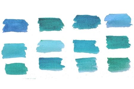
- Cobalt blue + Viridian Green
- Cerulean blue + Viridian Green
- Phthalo blue + Leaf Green (sap green can also work with slightly different results)
Above I have mixed a range of blues and greens to make teal. You can see above that the teal here is mixed with the same colors as the turquoise above. It is simply darker. I have included a range of colors here. Teal is the darker green-blue color shown above. As you mix in less green the color becomes more turquoise. If you want it to be more intense simply add less water or layer.
You have to watch your use of viridian green it is very intense and the colors can change very quickly.
