What do you do when your painting isn’t as vivid as you would like? Is it your paint, your techniques, or another reason? It can be difficult to know how to make your paint more vibrant with acrylics but there are lots of simple things you can do to improve how vibrant your paint looks and ultimately improve your painting. Some of the techniques I have put in below I have used for ages while others I have recently discovered. I know they will be of use.
There are lots of ways to make acrylic paint more vibrant. While the choice of paint and paint color are important and make a difference, the techniques you use and how you use them can have a huge impact on how vibrant your paints look. In addition, your painting surface, and how you prepare it also affect the overall vividness of your painting.
Once you know where things are going wrong it is the first step to putting them right and moving forward in your artist’s journey. Below I share where things can go wrong along with examples. Some of these are straightforward. Others while easy to do, take longer because they are bigger subjects in themselves that cannot be covered in one article.
15 Easy Ways to Make Acrylic Paint More Vibrant
I recommend that you take a look at the possible reasons why your paintings aren’t as vibrant as you would like below. It’s not about following rigid rules but understanding how each thing can affect your picture and whether you want it to or not. Sometimes you will want to use the techniques or ideas listed below as they are not bad techniques in themselves. It’s just how and where they are used that makes a difference. Each picture will be different and need different choices.
It’s a good idea to identify one area where you could be having issues and change just that so you can see which technique is causing you problems.
Use A Better Quality Paint
Many artists say not to use student-grade paints and to go for the artist’s quality.
I admit I have never had issues with student grade paint and have used it for years in combination with artists’ ones as the years have passed. (Although I noticed recently they now say they are both student and artist quality paint). However, the reason for not doing this is sound.
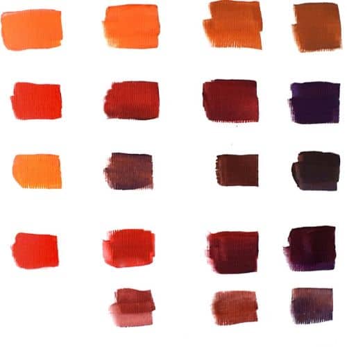
The reason why artists’ colors are advised even for students is that they are much better quality overall and are more vibrant and more pigment dense. There is more color in artist (or professional) quality paint while student grade has more filler in it. The colors are usually a better quality often where appropriate with more natural rather than cheaper substituted man-made pigments which make them more expensive. It is using the filler that keeps the paint cheaper. The pro paint covers better. And it certainly lasts longer before it dries.
You cannot argue that artist-quality paint is more vibrant than student-quality paint. It’s very easy to show examples of this. It doesn’t help when different artists give different advice.
If you are using a cheap student paint upgrade to a better quality student paint. I have tried out some of the cheaper paints and they are not that great.
If you are using a good quality student paint and feel it will help go for an artist quality. But if you are on a better quality student paint made by a good brand and not a basic one then it’s more likely that your issue with vibrancy is one of the other issues mentioned here.
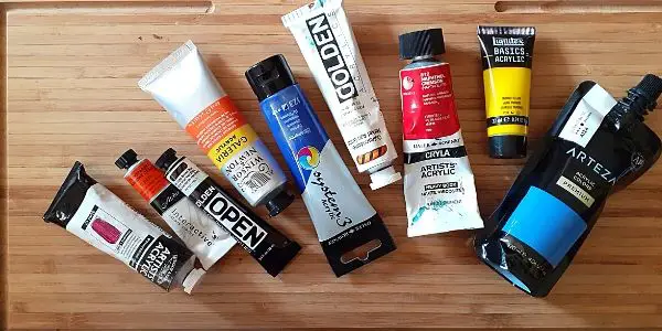
Below is a range of my paints from very basic lower quality ones right up to the professional ones.
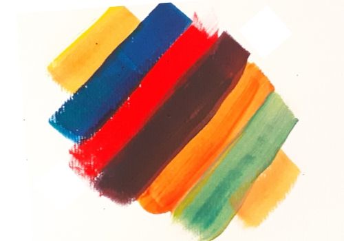
Use The Color Wheel To Pick Complementary Colors
If you paint colors that are opposite on the color wheel next to each other on your painting it makes each of the colors look more vivid.
Examples of complementary colors:
- Blue + orange
- Blue-green + red-orange
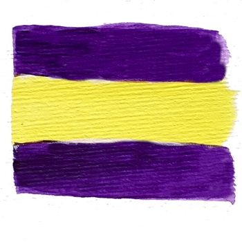
- Purple + Yellow
- Red + Green
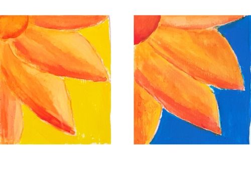
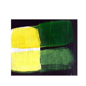
You can see from the two examples that the righthand image stands out much more than the left one even though I have used all warm colors for this sample. This is because it is the exact complement of the orange. If I were to use a cool blue it would recede into the background.
The colors I used are
- cadmium yellow,
- cadmium red
- cobalt blue (some people say is warm others say it is neutral)
The challenge here is that flowers more often than not have green foliage behind them, not blue sky. Although it is not directly opposite orange on the color wheel, green also works well especially if you use a blue-green which is opposite a red-orange.
Some people find the contrast too vibrant. So using a color on either side of the direct complimentary has an effect but is toned down slightly. A careful selection of color opposites and compliments can make your work stand out. It’s up to us as artists if we want that or not. For example, there is no reason that the image on the left can’t have green foliage to split the two similar colors.
Use Warm Colors Next To Cool Ones
A great way to make your art more vibrant is to use warm colors against cool ones. Cool colors recede and warm colors advance. When you do this it makes the warm color really stand out.
This is similar to using opposites next to each other but they do not have to be exact opposites and the colors have to be a cool/warm combo which gives you more scope in your painting. This is perfect for flowers that are more likely to have a green background than a blue or purple one.
It also creates depth to your painting which itself gives more life. If you look at any landscape tutorial or painting you can see this method in action easily. The background is often a softer, paler, or more subdued color. Cooler colors are often used to create depth because of this. Even look at a photo or go outside and take a look at the local landscape where this occurs naturally.
Place Light Colors Next To Darker Ones
A way to make part of what you are painting seem vibrant is to put a light color behind or next to a darker one.
Because darker colors recede and lighter ones come forward you can use this to your advantage while painting to make part of it stand out. This makes the painting really pop. This doesn’t have to be a different color, it can be the same color but simply lighter or darker.
This doesn’t have to be large areas either it can simply be around an edge just to separate the colors
Placing Darker Colors
For example the shadow of the foreground object on the one behind. Doing this really makes your main subject seem more vivid.
Another way to do this for water or other reflections is to make the reflection itself slightly darker. So, if you are painting a sunset seascape use the original colors for the reflection but darken them down a small amount, this really makes the sky brighter and stand out more.
Placing Lighter Colors
If you have two similar colors or you want to separate the main object from the background by adding a highlight around the edge where applicable you can make it really stand out.
2 Ways To Make Your Painting Glossy
There are two ways to make your painting glossy. You can either use paints that have gloss in them or you can gloss the whole painting when you have finished it. Both can work but they work in different ways.
If you only want to make part of your painting stand out more than the rest you can use paints with gloss in them. A good example would be white used for highlights. The gloss really brings out the lighter colors and makes those brushstrokes stand out more.
Varnishing your painting can really bring it to life and make it feel more vibrant. When you varnish your painting to protect it you can use a gloss varnish or a satin varnish rather than matte to bring out a higher shine.
I’ve never been a big fan of high shine pictures, not even when doing photography so I usually use satin for some shimmer but not too much. It’s a matter of personal preference and what might be suitable for that particular painting.
Don’t Use Black Paint (For Now)
One piece of advice you will hear time and time again from artists is “Don’t use black paint”. It’s so annoying as nearly every acrylic paint set has black in it – even the artist’s quality ones, Argh! You end up with useless tubes of black paint. I noticed recently that some brands have stopped this practice. I spent ages not using any pre-mixed black paint, always mixing it myself because of this.
Generally, this is good advice because most experienced & professional artists say that using pre-mixed or in some cases, any black while painting makes your artwork dull and lifeless. While this isn’t always the case and I’ve seen professional artists create stunning work using black in their mixes, it’s a good place to start if you are having any difficulties with dull colors.
If you are having difficulties with vibrancy and are using black, especially premixed tube or bottle black look at how you are using it and where and find another way to mix the color without using it.
For instance, if you are painting shadows don’t darken your colors with black. Instead, use a cooler darker color. Purple is popular but it depends on what you are painting.
It doesn’t matter if you need actual black or are using it to create a shade.
It’s good practice to avoid black for darkening colors as you learn a lot more about color mixing this way.
However, having said this black isn’t the enemy. You can use it to make green and to tone down other colors. (The reason I am saying not to here is that it may be what is causing your paint to be less vibrant).
Black makes a great base for dark areas of your painting (you can also use black gesso.
If you intend to use ‘black’ in the actual painting it’s a good idea to mix it yourself. While testing if this is what is causing your paint to be dull I’d avoid even doing that if possible.
If black is your go-to choice for darkening down your colors then give it a miss for a while and use other colors. This way you can see if using black is what is causing your artwork to become dull or not. You will end up with a better understanding of color mixing and be able to see what’s wrong and make those choices for yourself in the future.
In my view, if you are using too much black in your mix then you may have issues with the next item on the list which is muddy colors.
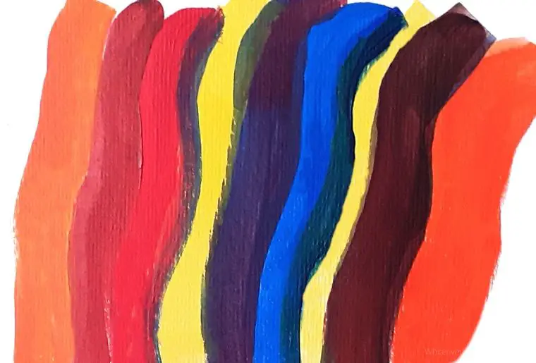
Don’t Muddy Your Paint Colors
When you mix your paints it is easy to muddy them. One way this can happen is if you use too much of the opposite color in your mix. Another is if you mix the ‘wrong’ types of colors together to create another color.
Muddy colors are simply those that are duller like grays and browns. Or murky like the desaturated purples. Or too much black added.
It’s not about avoiding the muddy colors completely. As with most of the other techniques here they are all valid. It’s about choosing when to use them and when not to make your work more vibrant.
At the end of the day, we need to have brown, gray, and muted purples, etc in our work sometimes depending on what we are painting.
As I am writing this I am painting a memorial picture of Holly, my black and white cat. Her black fur has strong undertones of brown.
If you look at the example above on the left is pure color. I have then mixed in colors in increasing strength which have muted them or muddied them.
- cadmium orange + cobalt blue
- cadmium red + cobalt blue
- cadmium orange + the mix above it (item 2) or cadmium red and cobalt blue
- cadmium red +ultamarine blue
- The above mix (item 4) with orange
In addition rows 2 and 4 are purple mixes. They are not bright vibrant purples.
Make Your Color Pop
Another way to create added vibrancy to your paint is to add a small touch of pure color as the last highlight or layer. This is a trick I learned from Ginger Cook.
What you do is use a less vibrant variation of that color or other color for the lower layers. At the last moment add nothing but pure tube color. On its own, this color will look too garish and false (depending on your overall techniques applied) But as an added extra used with more subdued colors, it really makes the color pop.
Creating Tonal Variation Is Key
A variety of tones makes for a vibrant picture. If you have all the same or similar tones, or even the majority of the tones similar your art will look wishy-washy and dull. It doesn’t matter if all those tones are light, dark, or mid-range.
To make your art more interesting make sure you have a good range of tones from light to dark. This will help your picture feel more vibrant and alive. You don’t need to include all of them, just a few will make a huge difference. If you combine this with other uses of your paint it will really make your pictures pop. The more tones the more realistic the painting.
A good way to check this is to have a good quality grayscale image of what you are painting. This way you can work out your tonal values in advance.
If your artwork looks dull take a picture of it. Turn the image to grayscale and see if it has a good tonal range.
You don’t need any fancy equipment. You can quickly take a picture and turn it to grayscale with your mobile phone.
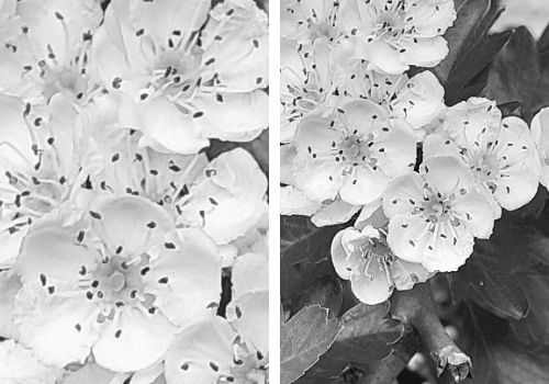
You can see from the two images above that the one on the right is stronger because there are several added darker tones in the background that make the flowers stand out. The tones on the flowers themselves are very subtle. When painting you could add a slightly greater tonal value to the actual flower.
Mix Your Own Grays
Gray like black can be more vibrant if they are mixed from other colors rather than mixed from tube blacks. Some artists prefer not to use gray at all, preferring to substitute it for other colors. For example, if painting shadows an artist will use purples rather than grays. It is a personal choice.
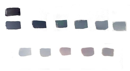
The top row is gray mixed with black. The bottom row is mixed gray which gives a richer color. This can be biased, in this case toward red. More on how to mix gray
Too Much White Paint Can Dull Your Work
Titanium white is one of the most popular whites to use. It is also one of the most opaque colors in acrylics. The more white you add not only the light the color but the more opaque the color it is mixed with.
If you use too much white in your mixes you lose the transparency effect. This can lead to a dull color and a lack of depth in your colors and painting.
Use a White Surface To Paint On
Many acrylic colors are transparent or semi-transparent. This works well with layering but this does mean they can show or be influenced by the color underneath. Also, many artists tint their gesso, use black gesso, or paint a base color layer. All are valid techniques to build up your painting. As an artist, you can take advantage of these techniques. However, you need to be aware of how each of these techniques can affect your colors so that they don’t dull them.
If you use a white canvas or part of a white canvas it can help to keep your picture bright and vivid.
If you are having difficulty with vibrancy I recommend that you prime your canvas with white gesso. Or use just the canvas as is if it is already primed. If you are using acrylic paper you don’t need to gesso it, just start painting.
For example, if you are painting a light sky and dark landscape leave the background white where the sky is but put black gesso on the base (optional) where you want darkness. If your landscape area needs to be bright simply only use white gesso on the painting surface or leave it white.
I have paintings where I put black gesso around the object I am painting but leave the area black. You don’t have to do this, there are other methods, but it is a great technique to keep your work vibrant.
What If Now Your Paints Are Too Vivid?
While this article is all about making your paints more vibrant it is possible to make them too vivid. Colors can look fake and garrish if you use them unmixed or don’t tone them down.
If you take some of the greens they are just too bright and don’t work well for leaves. The phthalo green and blue pigments are stunning but way too bright for many uses.
Ironically you can use the same techniques to dampen down that garish look as you do to make them less vibrant. It’s all about balance. If you find now you have used these techniques that your paints are too vivid simply put a touch, the most minuscule amount of complementary color into your mix to take the edge off.
Make Your Yellow Acrylic Paint Brighter
Most but not all yellows are transparent or semi-transparent. They do not cover other paint colors very well. If you want to make your yellow paint stand out and be more vibrant a good way to do this is to paint white where you want yellow and then paint the yellow over the top.
Above is cadmium yellow and lemon yellow painted over black and then over white. You can see that painting over the white really lifts the color.
Another way to make the yellow seem brighter is to use one of the techniques discussed above and to paint a contrasting color from the color wheel next to it.
How To Make Red Acrylic Paint Brighter?
- If you want your red to look brighter you can use any or a combination of the techniques mentioned here to give it the feeling of being brighter.
- The trouble with this question is that it does not say which red acrylic paint. It might be that you have blue-leaning paint and really need yellow-leaning red paint. Some reds out of the tube already look brighter. Cadmium red looks way brighter than alizarin crimson. In this case, simply change the paint to a brighter one. There are lots of reds to choose from. You should have at least one cool red and one warm one.
- If your red does not feel bright enough use a warm red as warm colors tend to stand out more.
As red is a primary color you cannot simply mix it. You can add other color combinations that will change that red but not simply use two or three other colors to mix red.
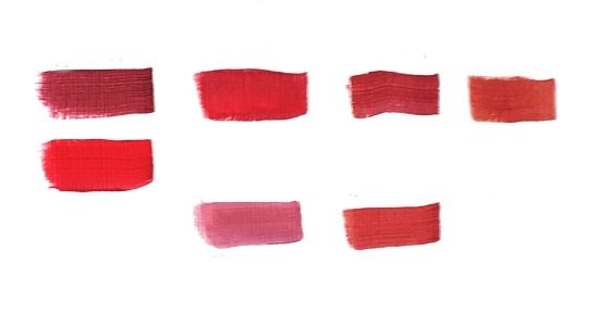
- Alizarin crimson, + cadmium red, +cadmium red, Alizarin crimson +lemon yellow
- Cadmium red on its own
- Alizarin crimson plus white, alizarin crimson +cadmium orange, and a tiny bit of white.
You can see from the above there is some lightness achieved without too much alteration to the main color by adding a brighter similar color and then adding a small amount of white. However, if you can why not start with the cadmium red.
